
Client:
CUPSHE
Role:
UX Design Intern for this project
Duration:
1.5 Months
As a UX design intern (freelance) on the UED team, I collaborated with another intern to lead the UX design for the Cupshe Club Reward Center on mobile. Focusing on the daily check-in feature, we integrated current membership marketing activities into a single page, allowing users to complete check-ins, earn points, participate in lucky draws, vouchers, and convert rewards—all in one place. The goal was to increase user retention and site visits. The product has since been successfully developed and launched.

Product Background

Brand Overview
Cupshe Club is a membership-based rewards program integrated into the Cupshe mobile app. It offers users incentives such as daily check-ins, point accumulation, lucky draws, and voucher redemptions. While these features already exist within the app, they were previously scattered across different pages, making it difficult for users to engage consistently with the program. To enhance user experience and drive engagement, the team aimed to centralize these reward activities into a single, seamless interface within the Cupshe Club Reward Center.
Problem Statement
Despite having various marketing tools like check-in rewards, vouchers, and lucky draws, their fragmented placement reduced user interaction and hindered traffic conversion. Additionally, a large portion of users remained as guests, lacking awareness or incentive to register as members—leading to low subscription, registration, and retention rates.
Design Process
01
Define the problem to align product and design goals
From internal analysis, we identified two major pain points affecting user engagement with the Cupshe Club:
Pain Points 1:
Scattered experiences – Features like check-in rewards, vouchers, lucky draws, and point-based incentives were spread across different areas of the app. This fragmentation made it hard for users to fully engage and limited overall traffic conversion and value realization.
Pain Points 2:
High guest user ratio – A significant number of users browsed without logging in or registering. The lack of awareness and motivation to join as members weakened their sense of belonging and reduced the likelihood of subscriptions, registrations, and repeat visits.
These insights pointed us toward one central challenge:
How might we encourage users to complete check-ins, earn points, join interactive activities and redeem vouchers in one unified experience—thereby boosting user retention and return visit rates?
02
Audit current experience and identify usability gaps
We started by mapping out the existing Cupshe Club experience across the app, reviewing how users accessed check-ins, points, vouchers, and other reward tools. These features were scattered in separate areas, requiring multiple clicks and making it hard for users to understand the full value of the membership program.
I conducted a UX audit and walkthrough of each flow, identifying inconsistencies in layout, unclear entry points, and a lack of hierarchy or guidance. At the same time, we analyzed user behaviors and marketing data to see where drop-offs occurred—especially between landing on a reward feature and completing an action like signing in or redeeming a reward.
These findings helped us highlight key usability gaps and confirmed the need for a more centralized, intuitive experience.
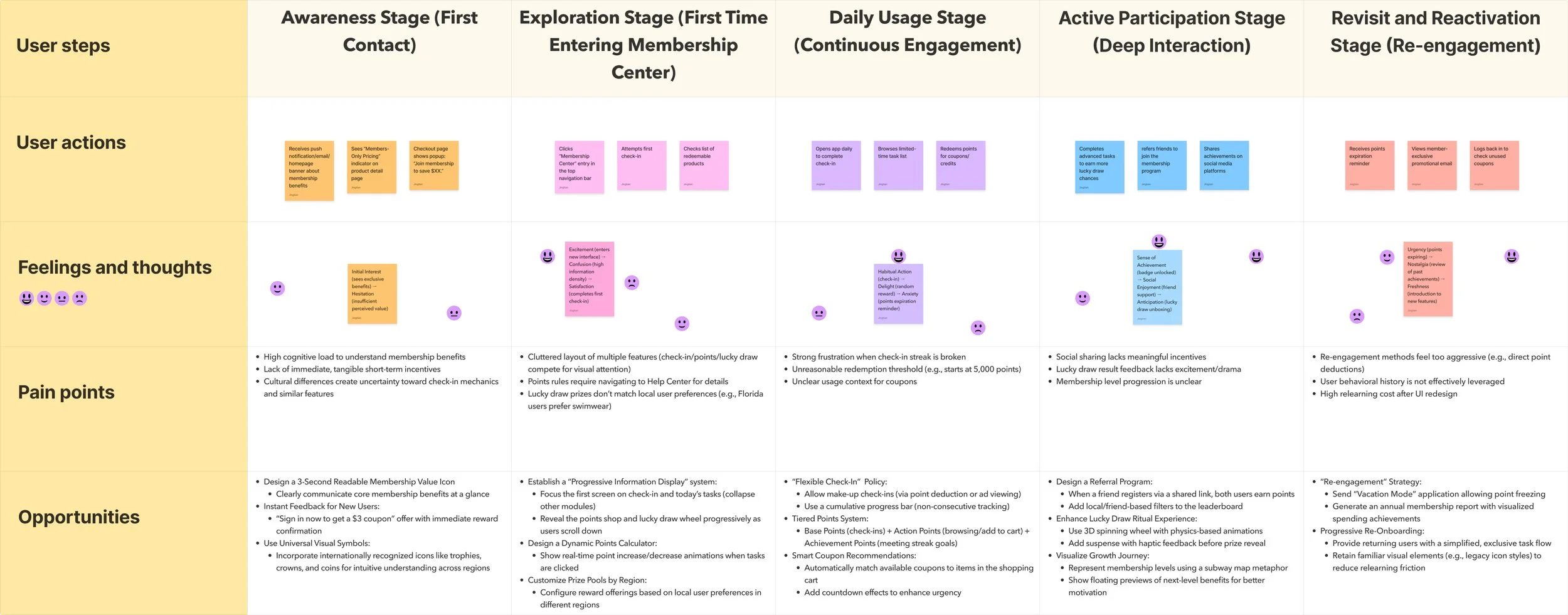
03
To better understand user behavior, I created a journey map covering all stages—from awareness to re-engagement. This helped identify friction points like:
Overwhelming first impressions
Confusing check-in mechanics
Frustration from broken streaks or unreachable rewards
Lack of motivation in deeper participation
Aggressive or ineffective re-engagement methods
The map aligned the team on key user needs and directly informed our solution designs.
Map the user journey to reveal stage-specific pain points
04
Design solutions
Solution 1: Integrate Club Center Entry & Page
To address the fragmented user experience, we prioritized consolidating all member-exclusive interactions into a single entry point: the Cupshe Club Center.
We redesigned the Member Center to highlight the reward system with a clear entry to the Club, prominently placing the daily check-in feature at the top of the page for maximum visibility and priority. This allowed users to easily track their progress, view reward points, and access redemption activities in one place.

Key UX enhancements included:
A visual check-in calendar to show streaks and encourage consistency.
A breakdown of points details to help users understand how each action contributes to their rewards.
A simplified redemption flow to convert points into coupons directly from the same page.
Solution 2: Add Gamify Engagement with Lucky Draw Interaction
To make rewards more fun and engaging, we introduced a Lucky Draw feature as a gamified mechanic within the Club Center.
The Lucky Draw is presented as a floating entry point—easily accessible but non-intrusive. Users can expand it anytime or let it automatically hide on scroll to avoid disrupting their main journey. Once opened, users are invited to spin for a chance to win points, coupons, or other surprises.


Key UX enhancements included:
A popup confirmation to immediately show rewards and encourage follow-up actions like "Shop Now" or "Continue to Play."
A participation record to give users transparency and build trust in the reward system.
A simple, looped experience that keeps users engaged while reinforcing the value of consistent participation.
Solution 3: Boost social engagement with referral-based coupon sharing
To encourage user acquisition and amplify engagement, we introduced a referral-sharing mechanism that rewards users for inviting others to participate in Cupshe Club activities.
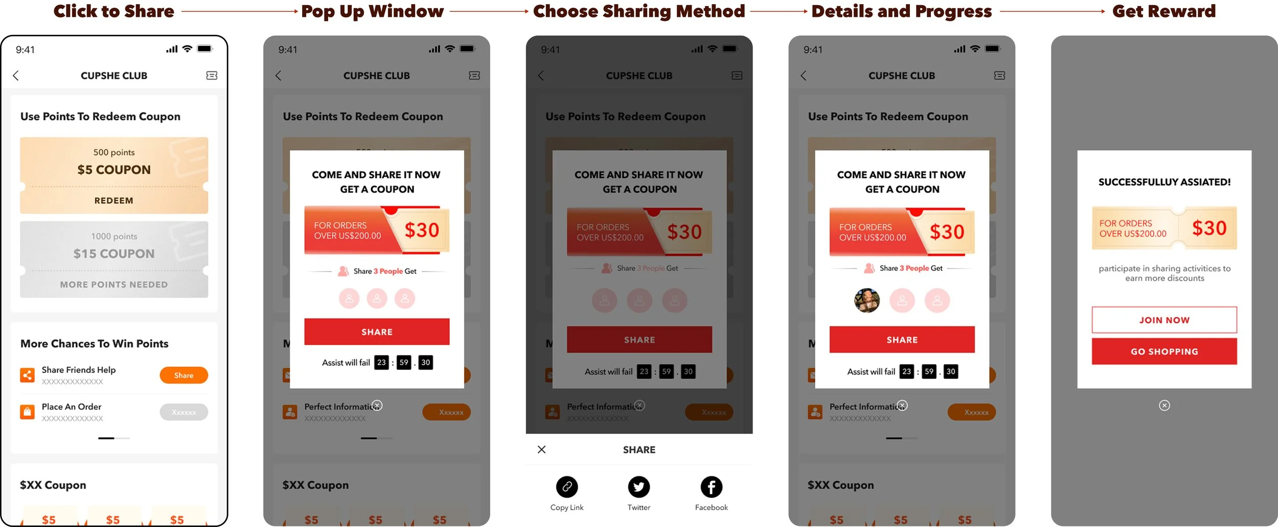
Key UX enhancements included:
Time-based urgency (e.g., countdown to share deadline) motivates quick action.
Transparent status tracking provides real-time feedback and builds trust in the process.
Integration into the Points Redemption flow makes it easy for users to discover and engage without leaving the reward ecosystem.
These three solutions worked together to transform the Cupshe Club into a unified, engaging experience:
Centralized access made rewards easier to find and use.
Gamified Lucky Draw boosted repeat engagement through fun interactions.
Referral sharing encouraged social participation and organic growth.
By simplifying and energizing the user journey, we increased retention, participation, and membership conversions
Handling Conflicts
Manual vs. Automatic Check-In: Aligning strategy with long-term behavior
PM’s idea:
Advocated for automatic check-ins upon page entry to reduce friction and prevent users from missing the feature.

What the PM Wants
My idea:
Supported manual check-ins, believing active participation builds habit, reinforces engagement, and improves long-term user retention and conversions.
How I handled the disagreement
To support my argument, I conducted a competitive analysis of major e-commerce platforms like Temu, Banggood, and Taobao—all of which rely on manual check-ins as a common pattern. Their approach emphasizes behavioral reinforcement, using large visual buttons and rewarding visuals to form daily engagement habits.
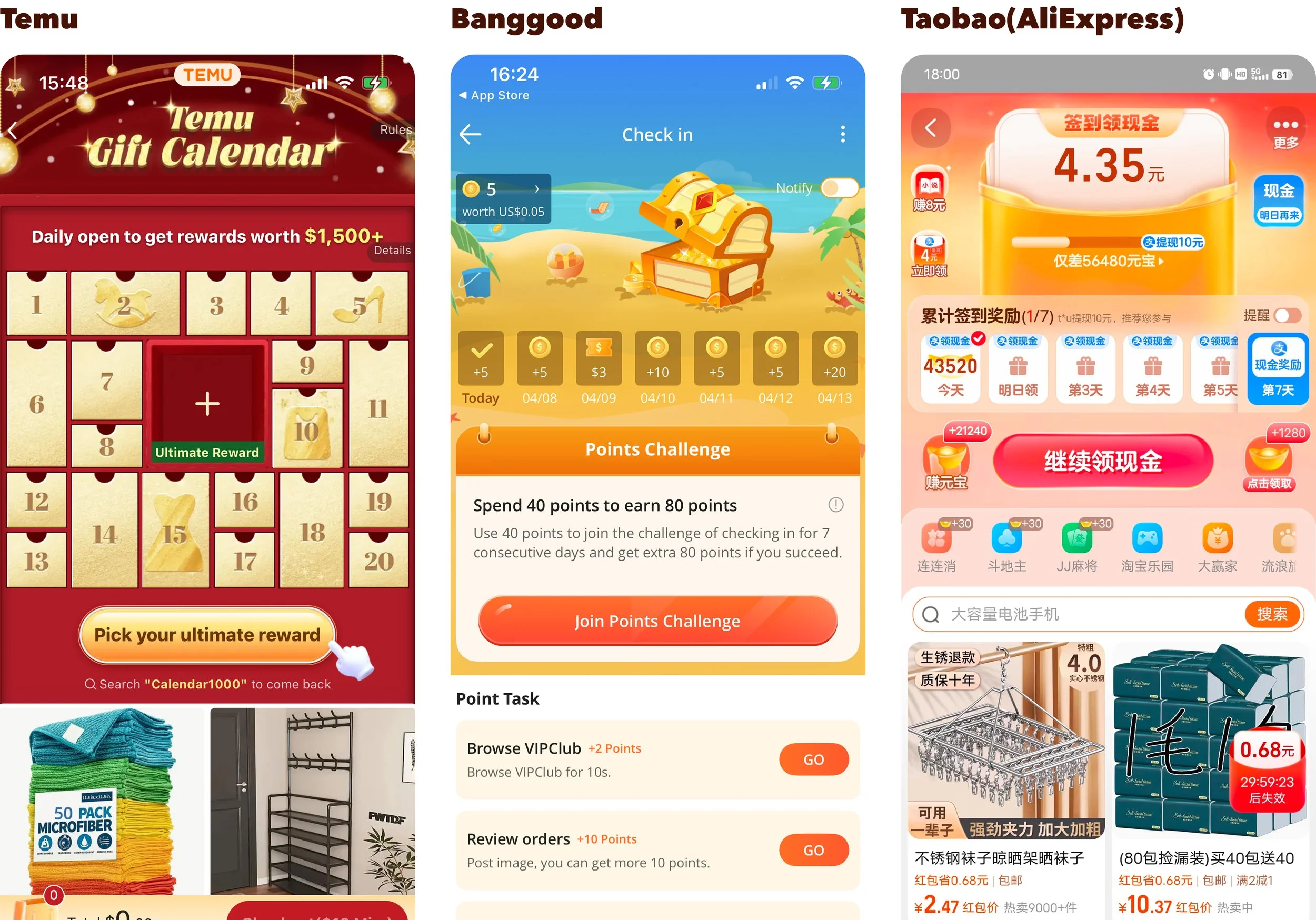
Commonly Used: Use manual click-to-trigger, with an enlarged check-in button for emphasis.
The check-in features of the three major mainstream products all aim to encourage users to manually claim rewards after use. The core purpose of the check-in function is to retain users and cultivate the habit of opening the app daily.
Types of Check-In Rewards:
Cash/Credits Rewards
Coupon Rewards
Item Reward
If check-ins are always automatic, users may feel that the rewards are simply handed out for free. Rewards that are given just for logging in tend to be overlooked by users, leading to poor engagement and effectiveness.
At SHEIN, the rewards earned through check-ins are fixed point values that do not change with consecutive days, so there isn’t a complex task system in place. Additionally, there are fewer follow-up activities, making automatic check-ins more suitable for their user flow.
In contrast, CUPSHE Club offers a wider variety of check-in rewards—not just points, but also surprise gift packs for consecutive check-ins. This makes manual check-ins more effective in driving user retention and visit frequency.
We shared insights with the PM,
which ultimately led to the decision of manual check-in.
Final Deliverable
We worked closely with the product manager, UI designer, and front-end engineer, syncing progress in daily stand-up meetings to ensure the design was implemented with 100% accuracy.

Observed Data and Self-Reflection
Following the launch of the redesigned Cupshe Club Reward Center, we monitored key engagement metrics to evaluate performance and guide future design iterations.