

Client:
VEST LABS
Role:
Lead UIUX Designer
Tool Used:
Figma, Miro, Notion, Adobe Illustrator, Adobe After Effects
Duration:
On Going
Vest Markets is a blockchain-powered equities trading platform that brings together the efficiency of crypto infrastructure with the familiarity of traditional brokerage. It offers zero-fee, 24/7 access to thousands of equity markets, with instant settlement and up to 50x leverage on NYSE stocks. With a streamlined email sign-up and USD-first interface, Vest Markets allows traders around the world to trade equities anytime, anywhere, without the barriers of crypto-native complexity. Vest Exchange was originally a crypto-native derivatives platform, serving advanced traders through tools like leverage, funding rates, and liquidation pricing. While strong for crypto users, this approach created barriers for traditional equity traders.

Project Background
The project started with Vest Exchange, a crypto-native derivatives platform offering leverage, funding rates, and liquidation tools for advanced traders. While powerful, its crypto-centric design created barriers for equity users seeking simplicity and trust. The redesign transforms it into Vest Markets, abstracting the USDC layer and presenting everything in USD to deliver a brokerage-like experience powered by blockchain—intuitive for stock traders yet still fast and liquid like Web3.

Design Goals
Transform Vest from a crypto-native exchange to an equity-friendly platform that feels familiar to stock traders.
Make blockchain-powered stock trading seamless and accessible, hiding the crypto layer behind USD-first balances and flows.
Deliver a trustworthy, brokerage-like experience with clear terminology, simplified navigation, and intuitive CTAs.
Retain the speed, liquidity, and innovation of Web3 trading while presenting it in a format equity users understand.
Problem Statement
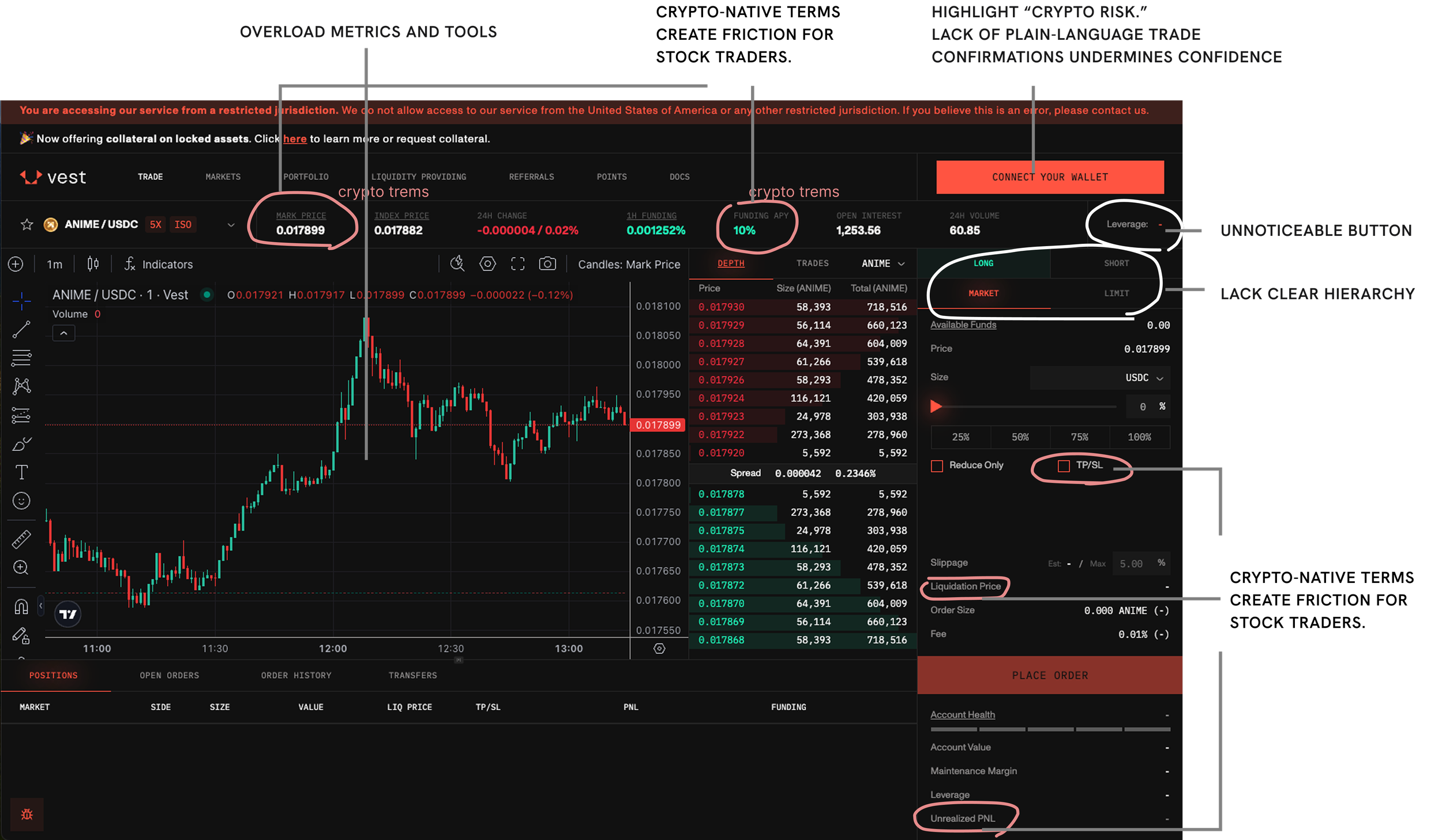
The original Vest Exchange interface was optimized for crypto-native traders, filled with complex metrics such as funding rates, liquidation prices, and leverage settings. While this met the needs of experienced crypto users, it created barriers for traditional equity traders, who expect simpler workflows, familiar terminology, and stronger trust signals.
As Vest transitions to Vest Markets, the key challenge is to abstract the crypto layer (USDC settlement) while delivering a USD-first trading experience that feels identical to traditional stock trading. Without a redesigned, equity-friendly UX, potential users may face cognitive friction, confusion, and lack of confidence, limiting adoption and undermining the platform’s goal of becoming a 24/7 global equities marketplace.
“60% of the content is hard to understand /navigate.”
User Interviews
I reached out to friends in the stock trading industry and also recruited 10 potential users who were familiar with equity markets but not with blockchain. I conducted some semi-structured interviews and usability walkthroughs to see how they interacted with existing platforms, what pain points they had, and what would make them trust a new product.
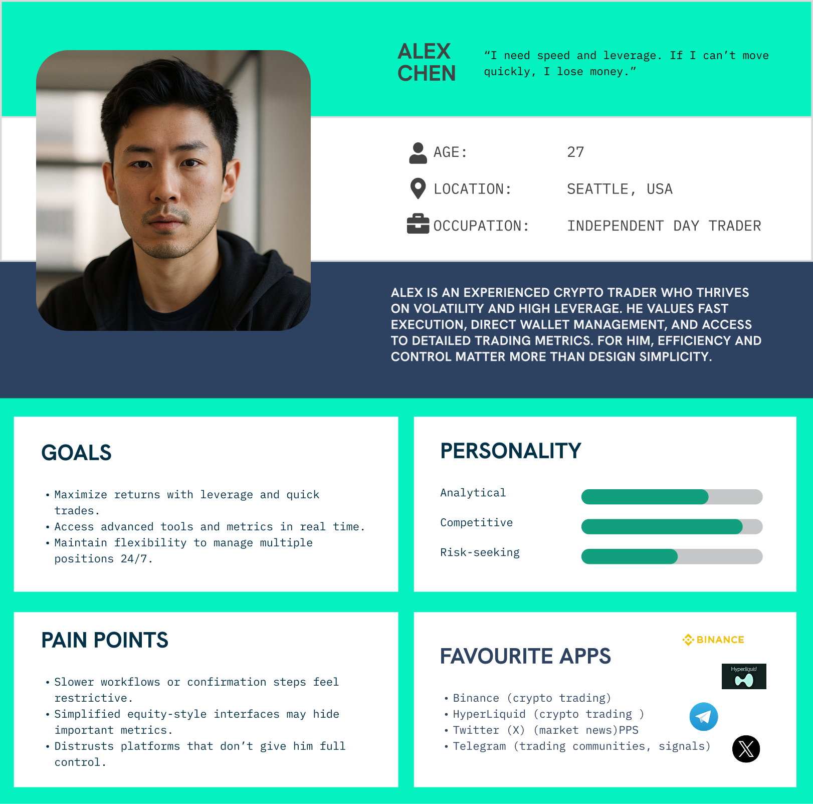
Crypto-native Trader
(Kevin, 29, New York)

“I trade every day on Binance and HyperLiquid. I use a lot of leverage, sometimes 20–30x. I watch the order book constantly and open/close positions fast.”
“Sometimes platforms make it hard to adjust leverage quickly. I need funding rates and liquidation prices always visible, otherwise I feel blind.”
“I don’t care if it’s in USDC or USD, as long as I can withdraw cash fast.”

Equity-focused Trader
(Brittany, 38, New York)
“I’ve invested in stocks for years, but I’m curious about new platforms. I sometimes check Coinbase for crypto but don’t trade much there.”
“Most crypto platforms feel overwhelming — too many numbers everywhere. I prefer clean dashboards like Robinhood.”
“Email-only sign-up sounds super easy, but I’d wonder about security. I’d want to know my money is safe before trying leverage.”

Stock and Crypto Curious Trader
(Kate, 50, LA)
“When I log in, I just want to see Buy, Sell, and my balance in USD. The crypto terms like ‘liq price’ make me freeze.”
“If I can trade NYSE stocks with no fees and without waiting for settlement, that’s a big deal. But it has to feel like Robinhood, not like a crypto exchange.”
Key Findings – Pain Points
Adoption barrier
Crypto traders chase speed & leverage; equity traders require a familiar, brokerage-like feel.
Interface overload
Detailed dashboards appeal to crypto traders but overwhelm equity traders.
Terminology gap
Crypto users want advanced metrics like leverage and funding, while equity users prefer simpler “Buy/Sell” language—clarity scores of 3.6/5 show the need for more intuitive terms and progressive disclosure.
Trust concerns
Equity traders doubt wallet security and email-only sign-ups.
Design Process
01 Personas
Developing Insight-Driven Personas to Inform Design Decisions
I created insight-driven personas from user interviews, capturing the contrast between crypto traders seeking advanced metrics and equity traders seeking simplicity, which directly guided our design decisions.

02 Competitive Analysis
Analyzing Market Landscape to Identify Gaps and Opportunities with AI
I then conducted a competitive analysis of Binance, Robinhood, HyperLiquid, and Axiom using AI tools like ChatGPT to quickly compare their information architecture, interface complexity, and trading flow transparency, identifying opportunities for Vest Markets to balance depth with simplicity and fully abstract the crypto layer.
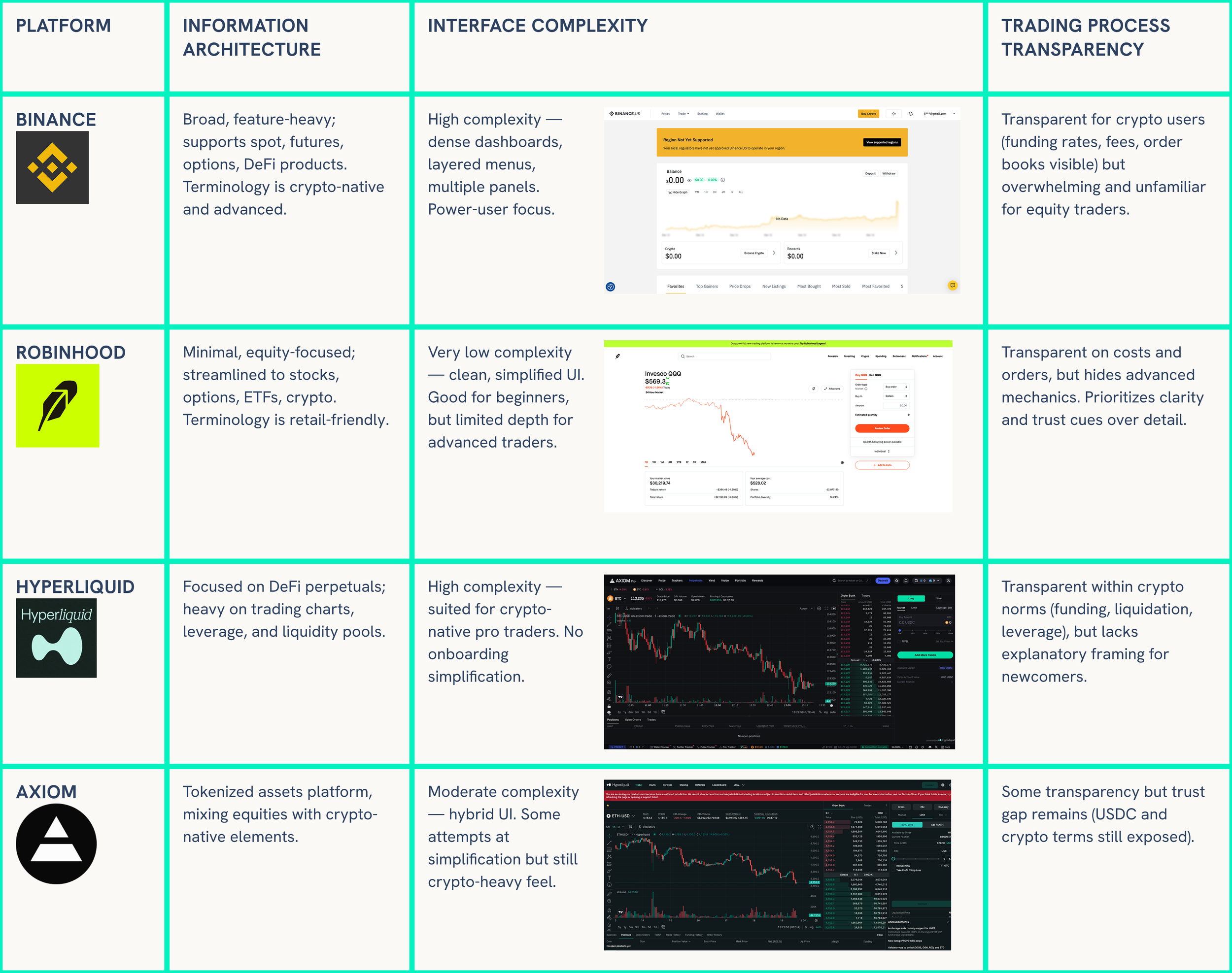
Findings:
Binance & HyperLiquid → Advanced, power-user oriented. Strong for crypto traders, but intimidating for equities traders.
Robinhood → Wins with simplicity and trust cues, but not deep enough for advanced trading.
Axiom → Closer to Vest’s direction (tokenized equities), but doesn’t fully abstract crypto — users still see USDC/crypto layers.
Opportunities for Vest Markets
Balance Depth + Simplicity
Position between Robinhood’s ease and Binance’s depth: keep advanced features (order book, leverage) but progressively disclose them so new users aren’t overwhelmed.
Crypto Layer Abstraction
Differentiate strongly from Axiom by hiding USDC completely. Present everything in USD-first, making it feel like a traditional brokerage.
Trust as Design Principle
Borrow Robinhood’s retail trust cues (clear onboarding, easy signup) but enhance them with plain-language confirmations, transparent fees, and USD balances.
Content & Insights
Add Trending / Top Movers and contextual market insights to guide new users — a gap missing in both Binance and HyperLiquid.
24/7 Trading as Differentiator
None of these platforms provide 24/7 access to equities. Vest’s round-the-clock stock market access is a unique market edge
03 USER FLOW
Improving User Flow
I transformed onboarding from a lengthy, KYC-heavy process into a fast and flexible flow. Users can now log in via Gmail, email, or passkey, verify with one-time codes through Privy/Plaid, and reach the trade page in as few as six clicks with only four required fields—ensuring no one fails to register while reducing friction and boosting trust. We mapped and refined the flow step by step to capture every detail, then simplified the trading flow (as shown in the attached chart) and added portfolio features that give users instant access to key metrics without extra navigation.
04 FIRST ITERATION
In the first iteration, instead of committing to a full redesign, I proposed a rapid usability testing approach. The idea was to make small but highly strategic changes—such as tweaking the color story, simplifying navigation flows, and testing alternate entry points—so that we could gather immediate feedback.
Easy Transition to Launch First Iteration
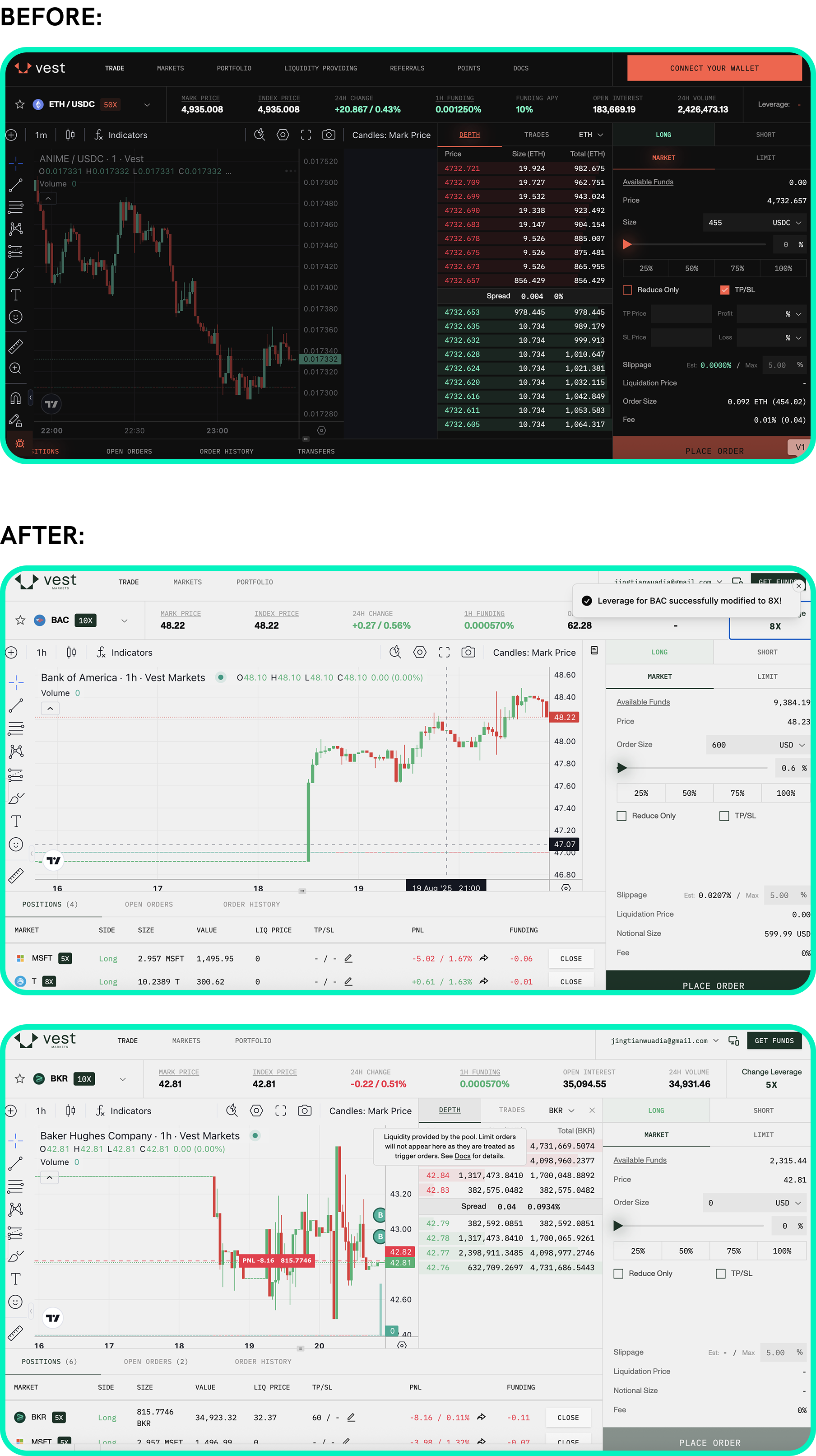
USD-first trading environment:
All balances, trades, and fees show in USD, while USDC settlement runs invisibly in the backend—making the platform feel like a traditional brokerage, not a crypto exchange.
Simpler and clearer trading experience:
Added some tooltips and inline explanations for key metrics (PnL, leverage, liquidation price), reducing confusion for stock-focused users who may be new to perpetual futures.

Cleaner and more equity-friendly interface:
Switched to a light background to align with mainstream stock apps like Fidelity and Robinhood, making the platform feel less “crypto-native,” while improving contrast and typography hierarchy to enhance readability of all necessary data.
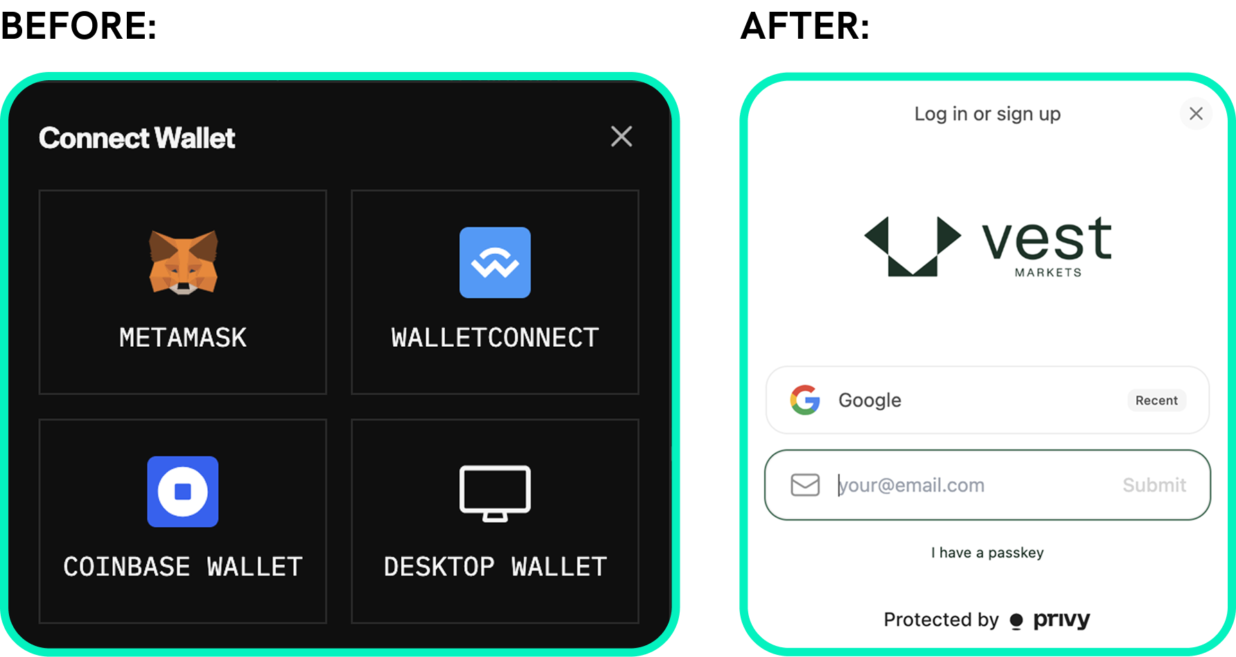
Smoother and easier onboarding:
Expanded sign-up with Privy and Google login to reduce wallet-only reliance and build trust, and simplified account creation to an email-first flow to lower barriers for equity traders.

Added slide-out Portfolio view:
Introduced a side-panel portfolio showing positions, leverage, and PnL without leaving the trade screen, reducing navigation friction and keeping traders focused.
05 HEAT MAP
Enabling Heat Map Tracking to Visualize User Click Patterns
I analyzed the heatmaps from usability tests to pinpoint where users hesitated or struggled—such as leverage controls, order entry fields, and portfolio metrics—to extract actionable insights for improving clarity and flow.
Insights:

Trade Page:
Heavy focus on the Change Leverage area shows it’s critical but confusing.
Users concentrate on the right panel (Price, Size, Slippage), indicating hesitation due to messy layout.
CTAs (“Deposit” and “Place Order”) are not visually dominant, slowing execution.
Sliders and percentage inputs look disconnected, causing trade size confusion.
Profile slide-out takes too much space, blocking content and leading to misclicks.
Heavy focus on terms like Slippage, PNL, LIQ price show they don’t know the terms.

Portfolio Page:
Users bounce between the top stock list and the list under the chart, indicating duplicated info causes friction.
Key metrics (PnL, TP/SL, funding) scattered across rows, making it hard to read account health at a glance.
Data fragmentation; No single place shows account health or statistics, users must scan across rows and columns
05 USABILITY TESTING
Running Usability Tests to Gather Actionable User Feedback
Our team conducted moderated usability tests with both internal participants (non-designers) and external users (traders and non-traders), asking them to sign up, add funds, trade (sell and close), check their profile, and navigate all pages. I then used AI tools like ChatGPT to analyze the recordings and notes, which helped me quickly surface patterns—such as confusion around leverage controls, weak CTA visibility, and fragmented portfolio data—and turn them into actionable design insights.
Insights:
Trade Page:
“Change Leverage” button lacks visibility, blending into text and not appearing clickable.
Missing “Trending / Top Movers” section reduces engagement and makes it harder for new traders to discover opportunities.
Sliders and percentage inputs appear disconnected, causing confusion when setting trade sizes.
Primary CTAs are weak, making it unclear where the main trading action happens.
Profile tab is hard to locate, and when opened, the slide-out panel takes up excessive space.
Trading panel feels overly complex, needing simplification for smoother interaction.
Market status is unclear, leaving users unsure if trading is available 24/7.
No visible support or help access, making it difficult for users to find assistance.
Portfolio Page:
Users struggle to find daily return/loss, a key metric they expect to see instantly.
Layout feels cluttered, with too many visual elements competing for attention.
Important stats are buried, lowering user confidence and trust in the data.
Basic information like shares owned and today’s return isn’t easily accessible at a glance.
Navigation between sections feels disjointed, forcing users to click around to find portfolio details.
Visual hierarchy lacks focus, making it hard for users to distinguish between primary and secondary information.
06 SECOND ITERATION-WIREFRAME
Developing Low-Fi Wireframes to Map Content Structure and Flow

For the trade and portfolio pages, I created and refined wireframes to identify the essential information each page needed, establish a clear hierarchy of that information, and determine the most effective placement of new features to improve usability and clarity.
07 A/B TESTING
Performing A/B Testing to Compare and Select the Best Layout
I performed internal A/B testing to evaluate low-fidelity wireframes for both the trade and portfolio pages. After testing several options with internal participants, we selected D wireframe for the trade page and A wireframe for the portfolio page.

We chose these layouts because:
Better content prioritization
Clearer and smoother flow
All information was used effectively with minimal changes—allowing us to validate improvements quickly before moving into high-fidelity design.
08 SECOND ITERATION - OVERALL OUTCOME
Rolled Out a Second Iteration Reflecting Key Learnings
Overall Improvement:
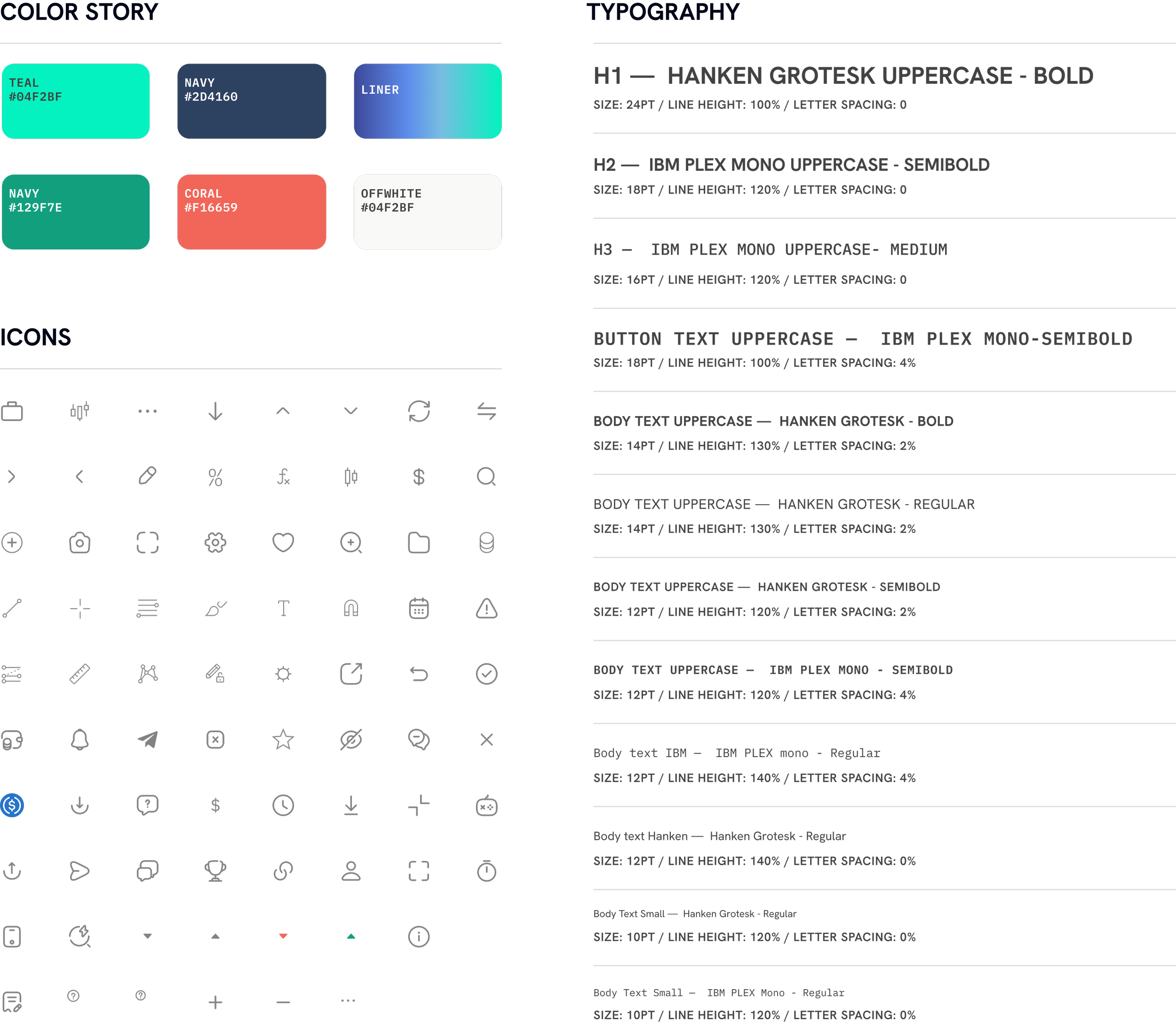
Redesigned the color story to be lighter and less aggressive.
Clarified terminology throughout to make features understandable to equity-focused traders.
Introduced contextual confirmations (plain-language order previews before submission) to build trust and reduce mistakes.
Reframed USDC as USD-first in the UI, raising clarity scores from 3.6 to 4.5 out of 5 in post-test feedback.
Added an AI-driven support/help floating button to give users quick and direct access to assistance.
Introduced a “Top Movers / Trending” section to help traders quickly discover active stocks without hunting through dropdowns
Trade Page:
Refined order entry panel layout by separating order type, leverage, and amount more cleanly for clarity.
Adjusted button hierarchy so primary CTAs (Buy, Sell) are visually dominant and intuitive.
Created two modes (regular and advanced) for the diagram/statistic area to serve different user groups.
Trade Page:
Simplified the trade panel by hiding advanced options to ease the trading flow for casual users.
Moved the profile slide-out to a dropdown so it no longer takes extra space on the screen.
Relocated the wishlist from the profile tab to under the trade panel using an accordion layout so users can choose to show or hide it anytime.
Portfolio Page:
Organized information modules to make key data easier to scan and understand at a glance.
Introduced “Top 3 Movers” and portfolio statistics to give users quick access to market activity and summarized performance insights.
Enhanced positions and orders list with clearer status and the ability to edit or take direct actions without extra steps.
Simplified charts and added customizable viewing areas so users can resize panels and focus on peaks, valleys, and what matters most.
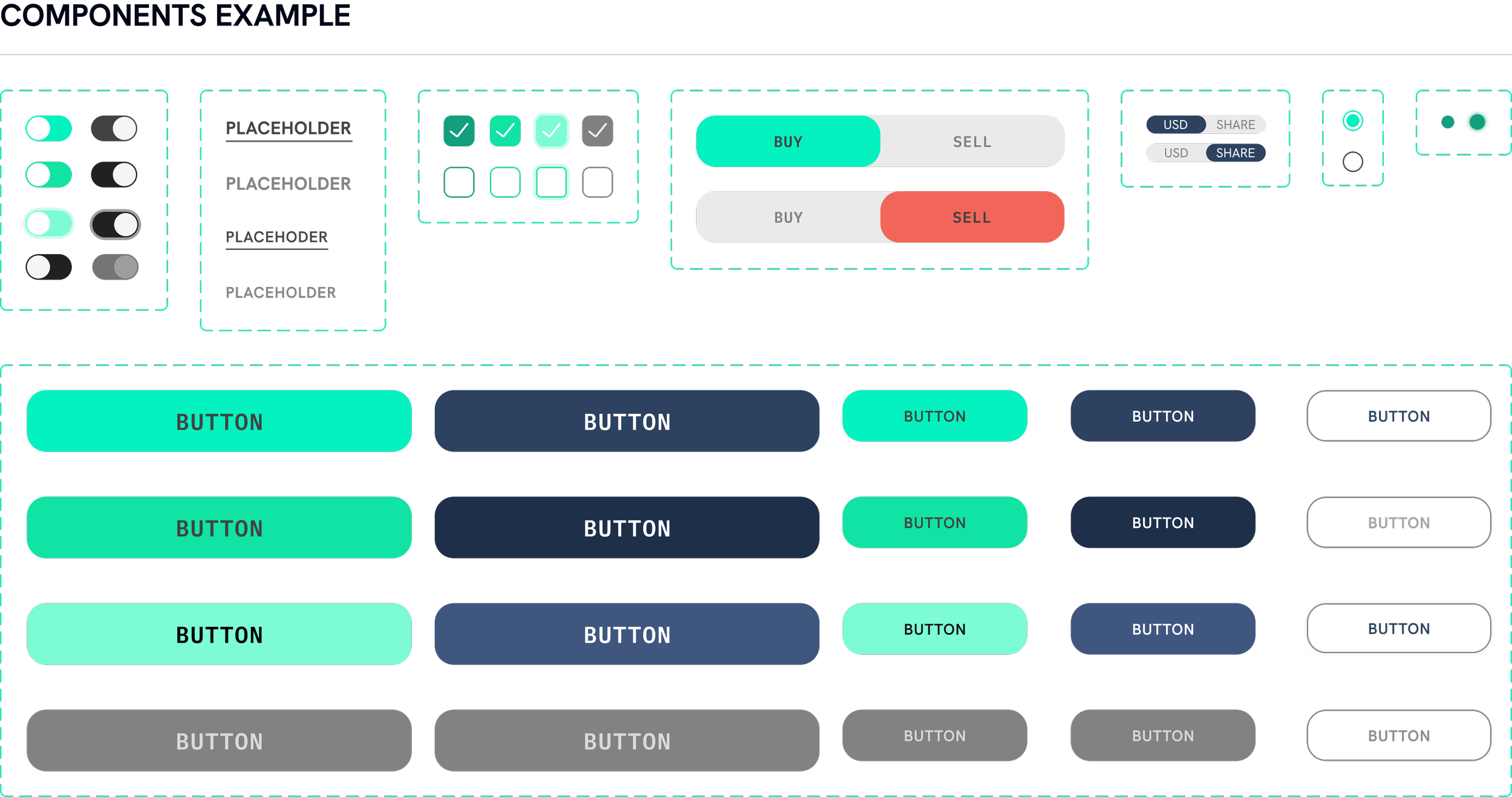
Proposed Design System
Going Forward

Deeper Usability Validation
Use UX assessment AI tools like Maze and Miro AI features to quickly test design iterations, analyze flows, and surface friction points at scale.
Targeted User Testing
Conduct moderated and unmoderated studies on usertesting.com, reaching both equity-focused and crypto-native traders for broader feedback.
Progressive Refinement
Continue refining dual trading modes with progressive disclosure, surfacing advanced features only when needed.
Education & Guidance
Add onboarding tips, contextual tooltips, and in-app micro-guides to help equity users adopt crypto-powered trading more comfortably.
Customization & Transparency:
Expand flexible portfolio modules and analytics, giving users the ability to tailor what they see while keeping interfaces clean.
AI Personalization
Explore more AI-driven insights to recommend trading tools, highlight top movers, and personalize dashboards based on user behavior.